Brand Strategy, corporate identity, collateral & environmental graphics
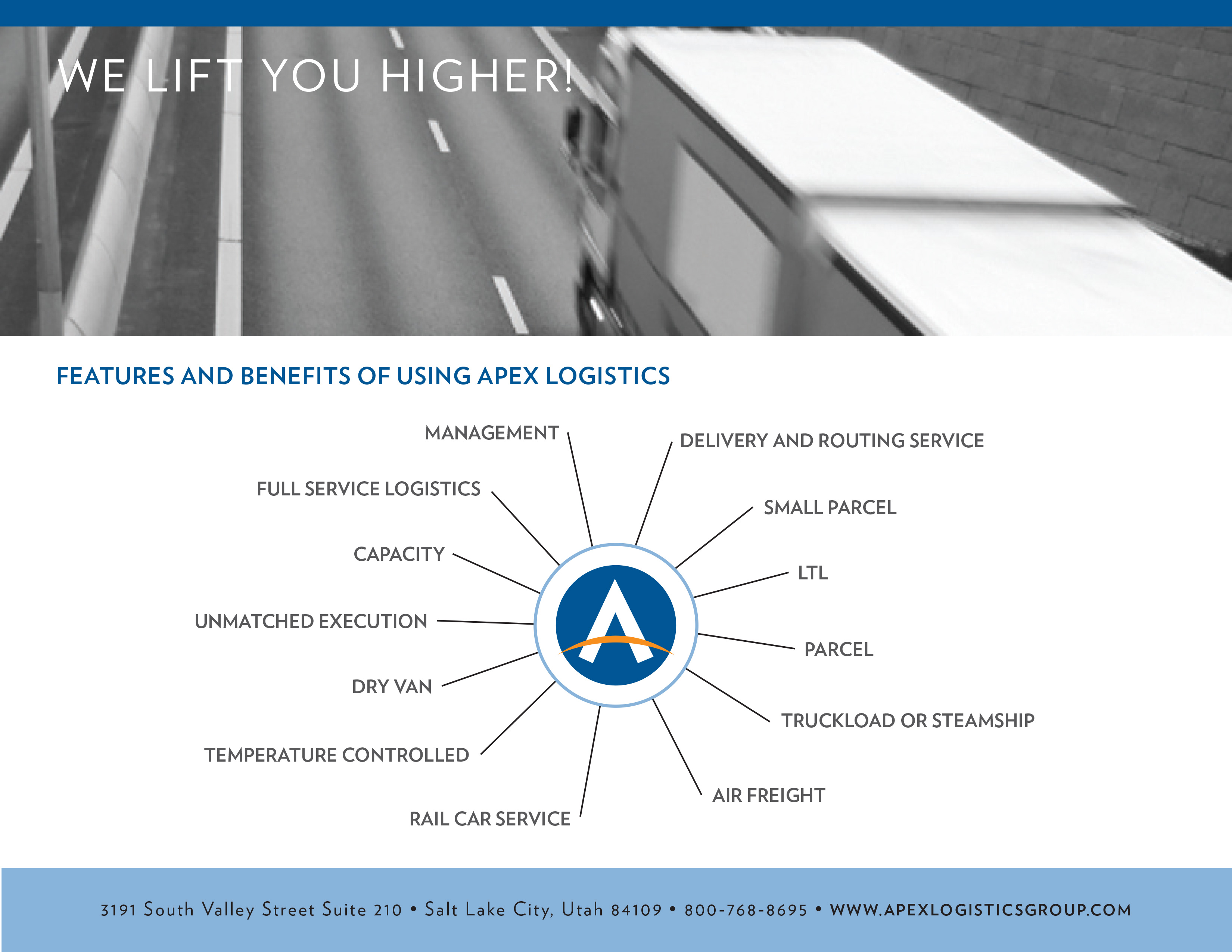
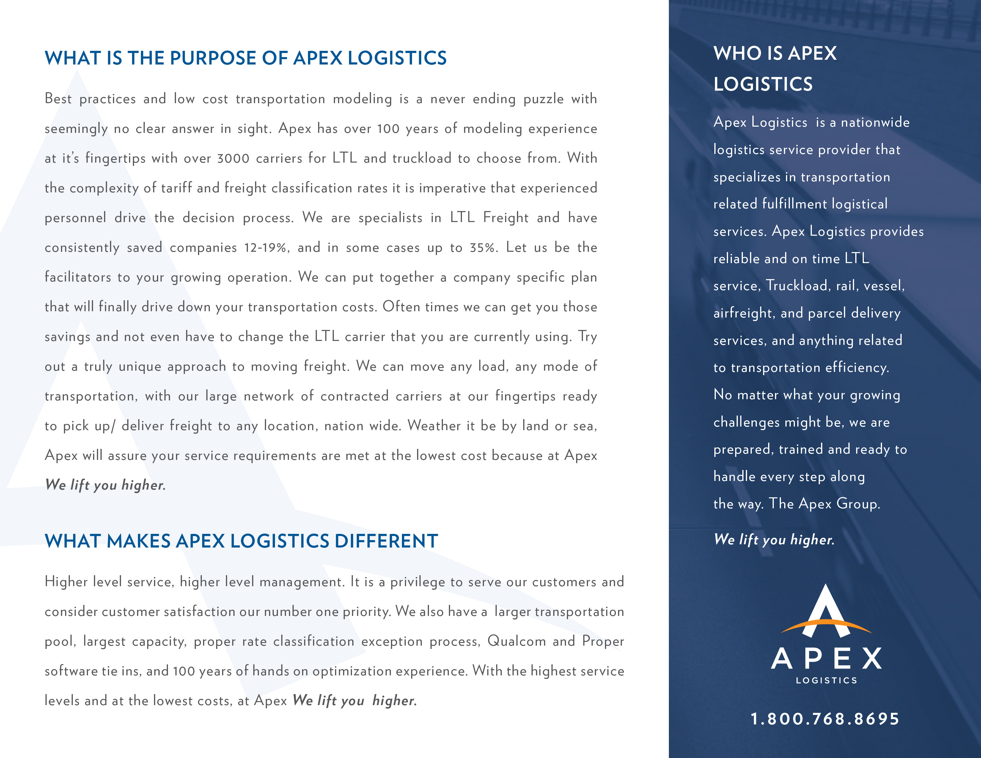
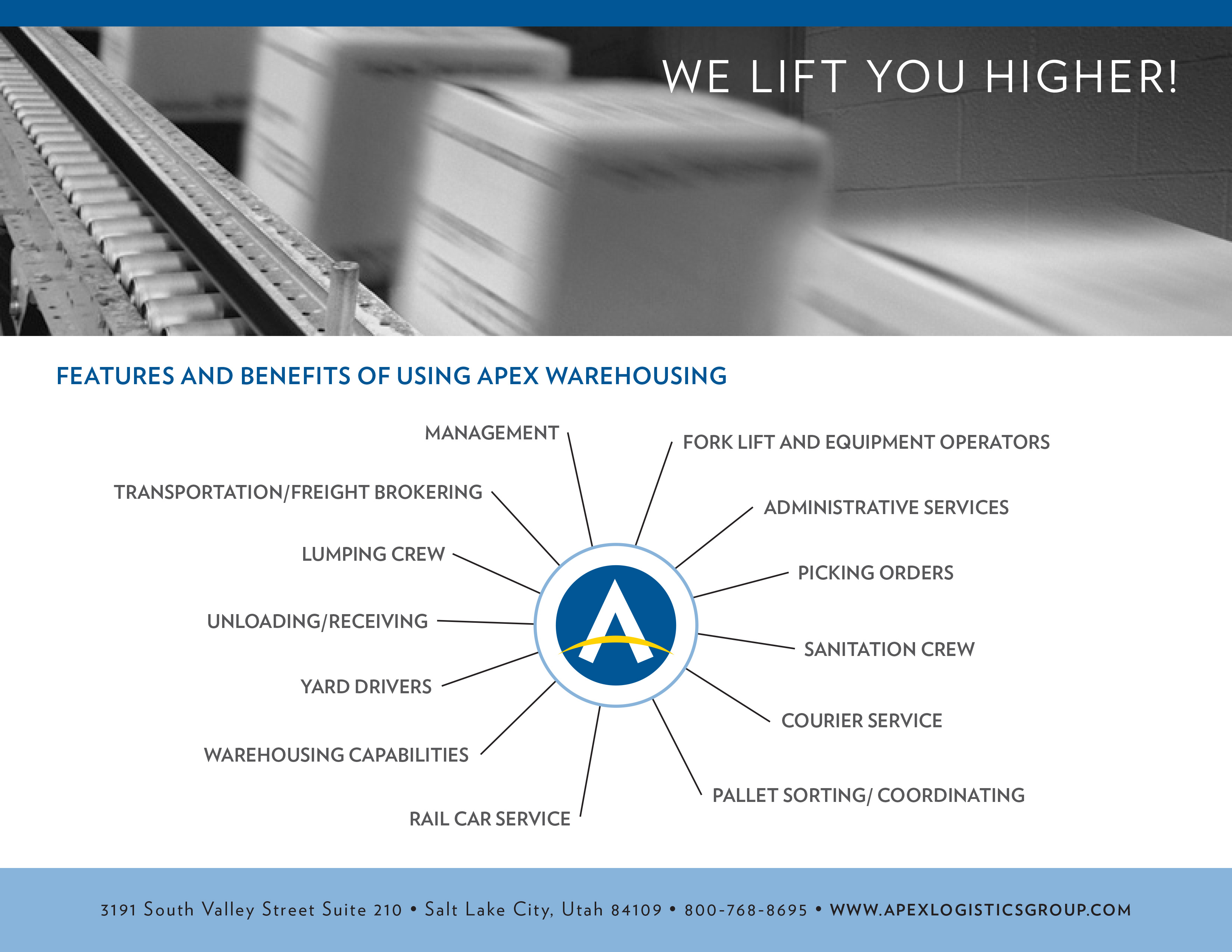
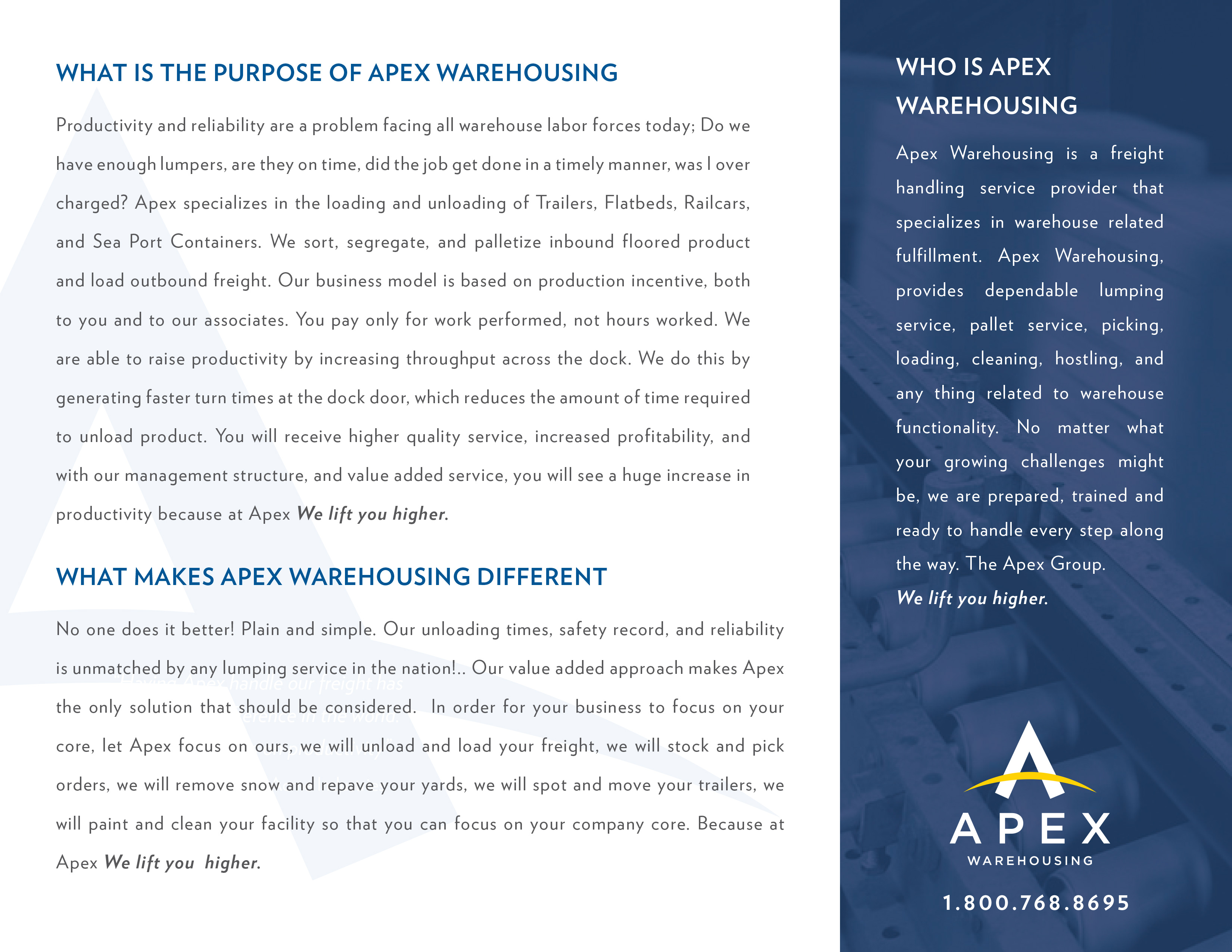
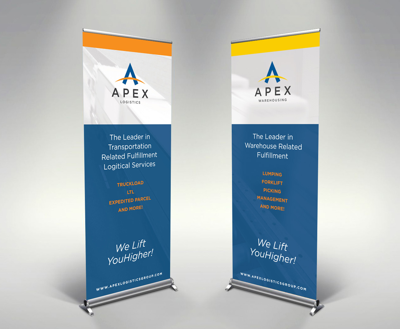
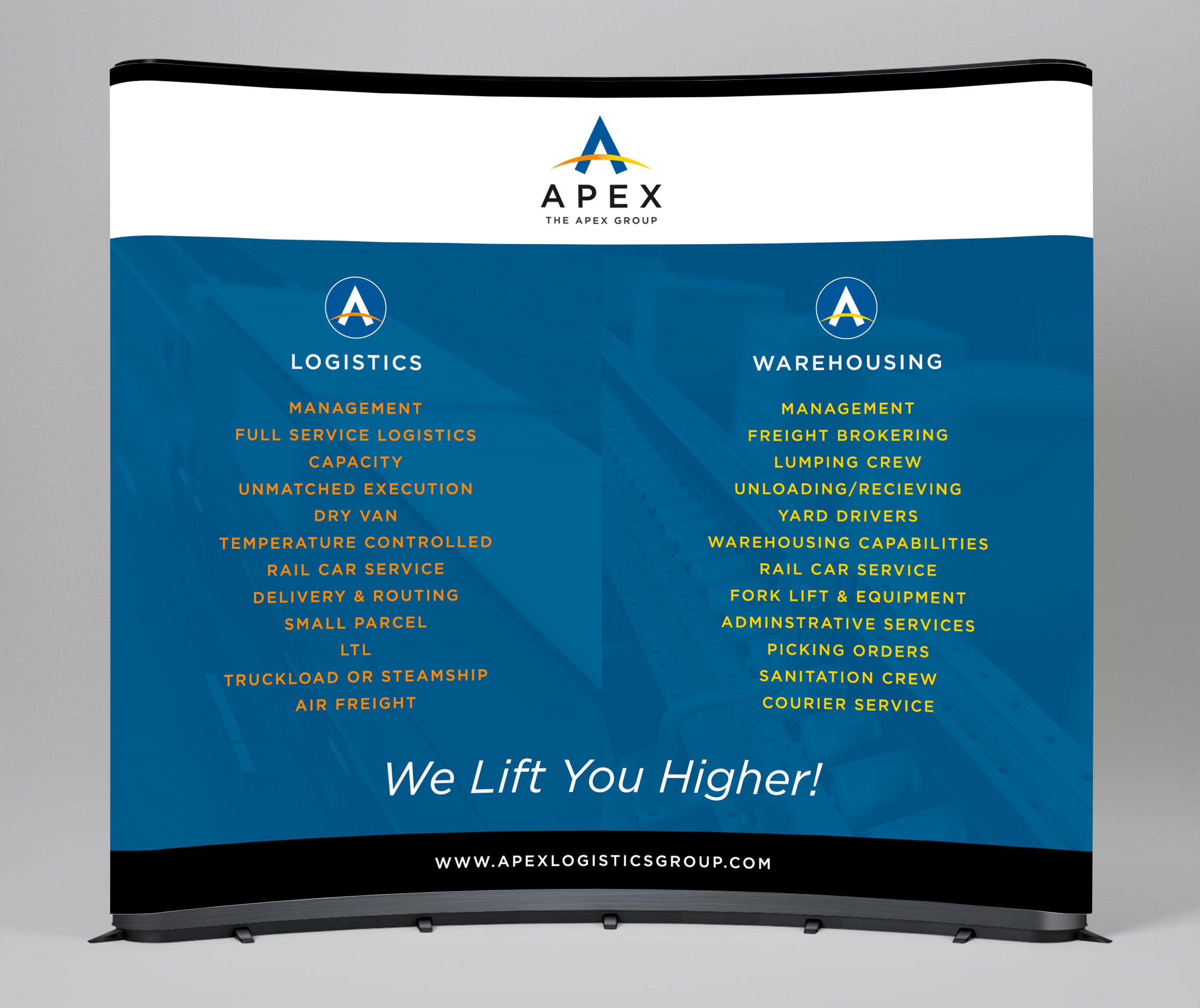
Apex Logistics has a lot going on. They have two divisions: Logistics and Warehousing, and wanted each to have their own identity and then also one to represent the family.
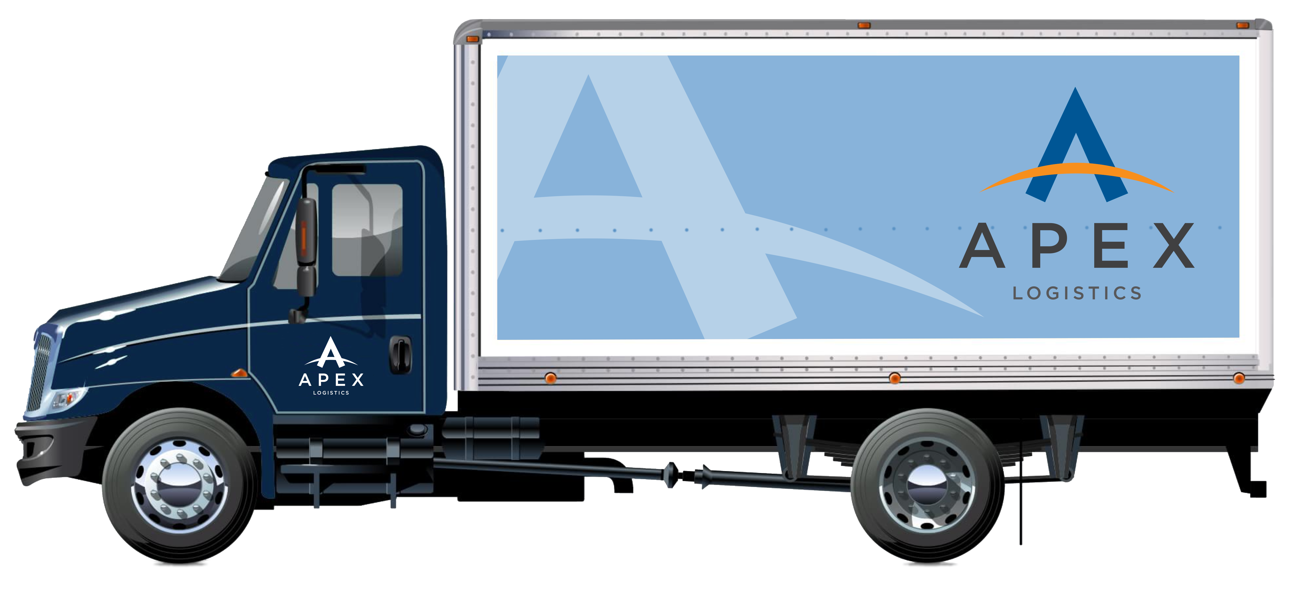
The cross-bar of the 'A' is the globe, because they are global. It's also a compass
because they know where they are going. Nice double entendre there.
The cross-bar of the 'A' is the globe, because they are global. It's also a compass
because they know where they are going. Nice double entendre there.
